USC Employee Gateway
Website & Newsletter Redesign
Art Direction, Motion Graphics, Design, & Photo Editing: Kandace Selnick
Creative Director: Candice Lawson
Web Developer: Cheryl Xu
In collaboration with the University of Southern California Human Resources, Equity, and Compliance Strategic Communications team, we set out to elevate the Faculty & Staff experience by optimizing and refreshing the look and feel of the Employee Gateway website and Gateway Connect newsletter.
The goal was to modernize and create a welcoming experience and visual identity for both the Employee Gateway website and Gateway Connect newsletter. Adhering to the USC Brand & Identity guidelines, we designed an expressive visual framework to lead and increase user engagement.
Further improvements include:
• Enhancing the site map structure and wayfinding, ensuring seamless navigation for visitors to locate information promptly.
• Elevating accessibility measures for an inclusive user experience.
• Designing the site with future scalability in mind, facilitating growth and adaptability.
Refreshed Pages
Old Employee Gateway Website
Newsletter
The Gateway Connect newsletter needed a refresh to feel more welcoming by enhancing the user experience, refreshing the visual design, and by developing a minimal design and layout that was consistent with the website.
The template was built with a modular grid structure that could seamlessly adapt to diverse content types, while prominently showcasing noteworthy stories catering to the faculty and staff readership. The redesigned layout brought about improvements in readability, scanability, and an overall enhanced user experience for readers. The condensed format ensured rapid weekly updates and modifications, accommodating varying content and news. Furthermore, a dedicated photo template was created, enabling consistent image sizes and fostering a seamless workflow between the newsletter and website article postings.
Previous Layout
Visual Brand Identity
Homepage Animation
The starting point for users is the homepage banner, which must effectively summarize the content in an engaging manner.
By designing an animated scroll with emphasized terms like resources, news, benefits, and support, users get a quick overview of the website's purpose without shifting their focus away from the rest of the homepage content. The highlighted keywords continue across each landing page on the site, utilizing the analogous color palette of the Employee Gateway branding in a gradient form.
Custom Iconography
Custom icons were created to help users navigate through a list of "table of contents" topics on landing pages.
Each illustrative icon encapsulates the essence of the corresponding topic and page. The icons were designed as a unified system for consistency, aligning with the overarching USC brand and the Employee Gateway site's visual identity. GIF animations were built for featured callouts in the Gateway Connect newsletter.
Icon design by Liz Crabbe
Art Direction and Animation by Kandace Selnick
Photography
Selection of featured images below (entire collection not shown).
Photography by Edward Carreon
Creative Direction, Art Direction, and Photo Editing by Kandace Selnick
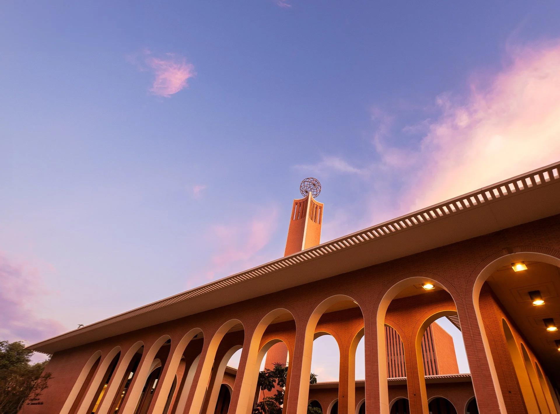
Faced with the challenge of capturing the USC campus, which had been photographed extensively before, my goal was to provide a unique perspective capturing special moments and elements that hold significance within the USC community.
My focus was on portraying not only Southern California but also the feeling of stepping into USC—a place that transports you to a unique campus with Romanesque architecture, waterfalls, clock towers, and cardinal flowers.
After careful research and location selection, I directed the photoshoot and photo editing. The aim was to evoke the serene beauty of Los Angeles during sunrise and sunset. The natural light and color palette of the sky enhanced the warm tones of the campus's architecture, capturing the spirit of the USC community. This community is nestled in the heart of one of the most vibrant and culturally diverse cities worldwide.






Visual Brand Identity
Engagement Banners
Leading the Art Direction and design for the engagement pages, my goal was to infuse a unique and celebratory experience into the banners. The banner design was animated to mark the introduction and launch of the first edition of the revitalized newsletter.
Design and Animation by Kandace Selnick


